|
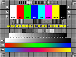
Monitor Calibration - Calibrazione Monitor ADJUST YOUR MONITOR Brightness - Contrast - Color
|
|||
|
Too many computer users take their new monitor out of the carton, plug it into the main box, and do nothing more. That is a shame, because few monitors are in exact adjustment right out of the box, and not fine-tuning your monitor can leave you ll unknowingly having a less than optimum viewing experience. If you find yourself asking how this or that web-page designer could have used those colors, maybe it's your monitor that's off (or maybe those designers really are idiots you won't know until you check your monitor). There are two major classes of adjustments you can make: those that affect the size, shape, and position of the screen image, and those that affect the content of that image. (It is most likely a defect in the second class that has brought you to this page). Before beginning, the most important thing you need to know is how to adjust your monitor's controls. The first step, if it's possible, is to carefully read the manual for the monitor (I say "if it's possible" because many users won't have that manual around any more). Most modern monitors are controlled electronically using pushbuttons usually located somewhere along the bottom of the front of the monitor; older monitors, of which many are still in use, have physical knobs or dials along the bottom edge of the monitor front face. If you don't have your manual any more, simply inspect the face of your monitor closely; as a rule, what you need to know can be deduced from what you see. Indeed, on many monitors the labels are tiny pictures, to avoid language barriers. Not every monitor will have every one of the controls I describe. If you are sure that your monitor is not equipped with a control I mention, just pass over that adjustment. (But most monitors will have most or all of these controls.) From here out, I necessarily assume that you at least can locate and operate the various controls I will be referring to. Don't worry about how to use those controls that's what this page is all about just be sure you know where they are. Another point: don't try any of these adjustments until your monitor has been on for at least an hour: monitors do "warm up" and look different after such warming-up times. Also, we need to understand this very important bit of terminology: the difference between the screen and the illuminated screen image. The screen is the physical glass-covered area visible within the plastic (or metal or whatever) frame around it; it is the very dark grey glass you perceive when the monitor is switched off. The illuminated screen image is the lit-up part of the screen you see when the monitor is in use; it is what the monitor projects onto (so to speak) the screen proper. The illuminated screen image may exactly match the screen proper in size (which is the ideal), or it may be smaller (in which case there will be a small unilluminated black band around it), or it may be larger (in which case the outer edge of the true screen image is invisible to you, clipped off as it were). Try to get used to looking at the screen image, probably defined by the edges of your on-screen "desktop," as a single entity, regardless of what's actually on-screen; think of it as "the lit up part." Note: With most or all of these controls, there are two ways to go about the adjusting, and which will work better depends on the particular person making the adjustment. One method is the "incremental": you make tiny incremental changes until you get the result you want. That method is the most obvious and works for most people. Sometimes, though, especially if the wanted result is a judgment call, what works is to run the adjustment up and down, from way off in one way to way off in another way (with optimum somewhere in the middle) several times, eventually trying to stop in the middle, at the optimum. Try both methods for any given adjustment and see which you prefer.
SETTINGS AFFECTING SCREEN CONTENT The
basic controls here are familiar from television sets (on which they are
usually far more horridly maladjusted than on computer monitors):
brightness and contrast. There is also, on some monitors, a simple
"color intensity" adjustment, while others have much more
complex color-control settings; of the latter sort of control, I will
say little here; but brightness and contrast alone are often so
maladjusted without the user's being aware of the problem that screen
content is needlessly contaminated, often badly.
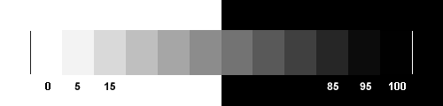
For approximate adjustment your monitor you should set brightness and contrast of the monitor on a maximum level, then gradually reduce brightness while the border between 95% and 100% fields does not become hardly visible. Then reduce contrast while white field (0%) has normal white color. More...
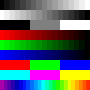
BRIGHTNESS AND CONTRAST These two controls interact. Moreover, they don't adjust what you might think from their names (the "contrast" really adjusts the brightness and the "brightness" really adjusts the base "black" level). There are many web pages dedicated to helping you adjust your monitor, and I link a few below. But not all explain well what to do in what order they just say "adjust the controls until the image looks right," or words to that effect. Be aware that the commonest error in monitor setting is having the (mis-named) "brightness" up too high. For a beginning, do this: 1) Turn the "contrast" control (usually marked with a circle divided vertically, one half filled in) up all the way. 2) Turn the "brightness" control (usually marked with a little sun-like image) all the way down--but finish reading these instructions first! (On a few monitors, turning the brightness down all the way may completely blacken the screen.) 3) Slowly turn the brightness up until you can just discern clearly each of the differently-shaded boxes in the black-to-white strip below; pay especial attention at the left (dark) end. When you can just discern, without straining, the leftmost box and the one just right of it, stop. Be sure to initially run the control past that point a bit, then run it down and up a few times; you want to get this one right. You may be tempted to set the control higher than what I have described; if you do, true black will be faintly gray and, worse, subtle differences in some colors will be hard or impossible to discern.
4) Try backing the "contrast" control off a little, keeping an eye on the image below. If the picture seems to improve with a little reduction of "contrast" from maximum, leave it set there. Note that the white areas ought to merge seamlessly with the background of this page. Be sure you can clearly discern every step on every color strip.
COLOR Of color adjustments I will say only a little, having little expertise in the more advanced aspects of the matter. If your monitor is old or primitive enough that it has a simple "color" or "color intensity" control, back that off all the way (everything will become black-and-white), then advance it until the colors look about right, preferably on a picture containing lots of natural color: a landscape with people in the mid-foreground would work well. "Color," when such a control is present (as it is on most television sets) is usually set far too high, giving among other things bleeding or saturated reds. If your monitor also has a "hue" control (as, again, most television sets do), adjust it by using the old standby of getting human flesh tones to look right. If, as many modern monitors do, yours has a "color temperature" setting, you can try cycling through however many preset combinations it has to see which looks best. (On my monitor, there are four such settings, and each changes the color of "pure white" significantly). I would not try to play with the actual detailed settings unless you know very well what you're doing (at least write down the original values before fiddling). |